


The front end of a website is the part that users interact with. Everything that you see when you’re navigating around the Internet, from fonts and colors to dropdown menus and sliders, is a combo of HTML, CSS, and JavaScript being controlled by your computer’s browser.
Front end web developers use three primary coding languages to code the website and web app designs created by web designers:
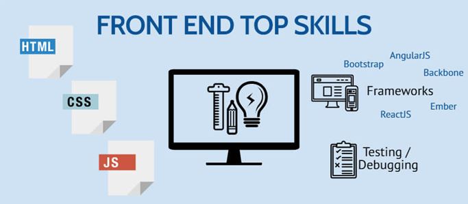
- HTML , the language that gives web content structure and meaning
- CSS , the language used to style web pages
- Javascript , the scripting language used to create dynamic functionality on the web
Responsive Web Design
Responsive web design is about creating web pages that look good on all devices!
A responsive web design will automatically adjust for different screen sizes and viewports.
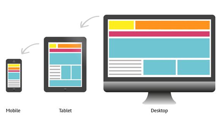
Responsive Web Design is about using HTML and CSS to automatically resize, hide, shrink, or enlarge, a website, to make it look good on all devices (desktops, tablets, and phones)
Three Important part make a responsive web page
- Fluid grids (Use Bootstrap)
- Media queries CSS
- USE Responsive Images
Fluid grids
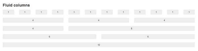
The layout of a website has to respond and adapt to the dimensions of the device on which it is displayed (responsive design). A fluid grid layout provides a visual way to create different layouts corresponding to devices on which the website is displayed.
For example, your website is going to be viewed on desktops, tablets, and mobile phones. You can use fluid grid layouts to specify layouts for each of these devices. Depending on whether the website is displayed on a desktop, tablet, or mobile phone, the corresponding layout is used to display the website.
Media queries CSS
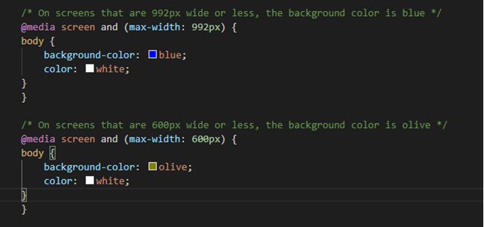
Media queries are useful when you want to modify your site or app depending on a device's general type (such as print vs. screen) or specific characteristics and parameters (such as screen resolution or browser viewport width).
A media query is composed of an optional media type and any number of media features expressions. Multiple queries can be combined in various ways by using logical operators. Media queries are case-insensitive.
A media query computes to true when the media type (if specified) matches the device on which a document is being displayed and all media feature expressions compute as true. Queries involving unknown media types are always false.
Benefits of Responsive web design
- More mobile traffic
- Faster mobile development at lower costs
- Lower maintenance needs
- Faster pages
- Lower bounce rates
- Improved SEO
- Improved online browsing experience
- Improved offline browsing experience
Read More :
10 Simple to Use Web Designing Tools Part-I


